



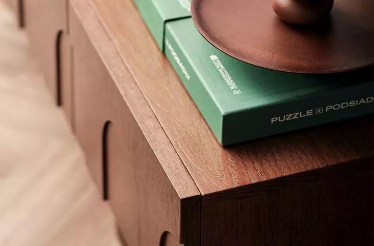
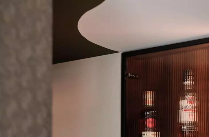
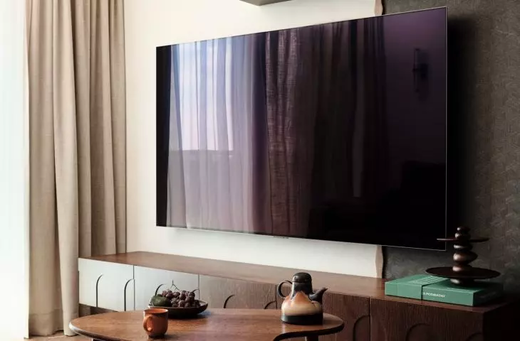
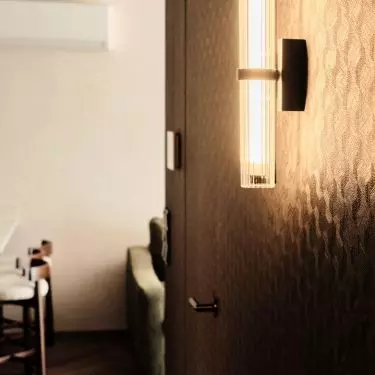
Nearly three thousand saved inspirations, a long list of expectations, and only 52 square meters to work with. When designing an apartment for a young couple in a Kraków neighborhood, Kamil Aksamit from SUSPENS studio had to translate the world of ideal interiors from Pinterest into a real space —with its limitations, proportions, and everyday needs. The result is an interior where, instead of trying to fit everything in, the focus was on a few well-thought-out compromises.
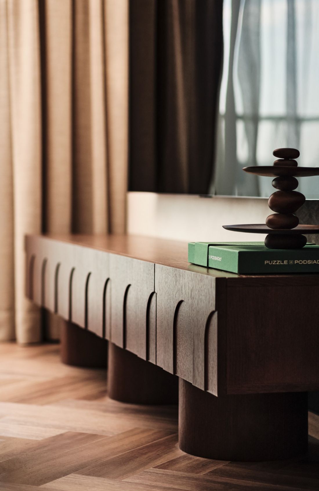
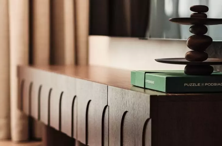
A veneered chest of drawers designed by Puvo Design has become the focal point of the living room — ©Jan Wąsowicz
How do you fit three thousand inspirations into 52 meters?
Pinterest can be an inexhaustible source of ideas, but it also has a drawback: many of the interiors we see on screen were created in spacious, well-lit homes. When transferred directly to a much smaller apartment, they can easily lose their airiness and proper proportions. The owners of a 52-meter apartment in northern Kraków faced a similar challenge. Their inspiration board had nearly three thousand images, and their list of expectations was just as long. The apartment was to include a bedroom dedicated exclusively to rest, a separate workspace, an extra room, plenty of storage space, a comfortable kitchen, and a living area designed for both quiet evenings for two and get-togethers with friends. Kamil Aksamit, lead designer and co-founder of SUSPENS studio, therefore had to adapt ideas drawn from spacious villas and single-family homes to the realities of a much smaller floor area. The most important thing was not to recreate specific scenes, but to capture what truly appealed to the owners—the atmosphere, colors, and materials that make them feel at home.
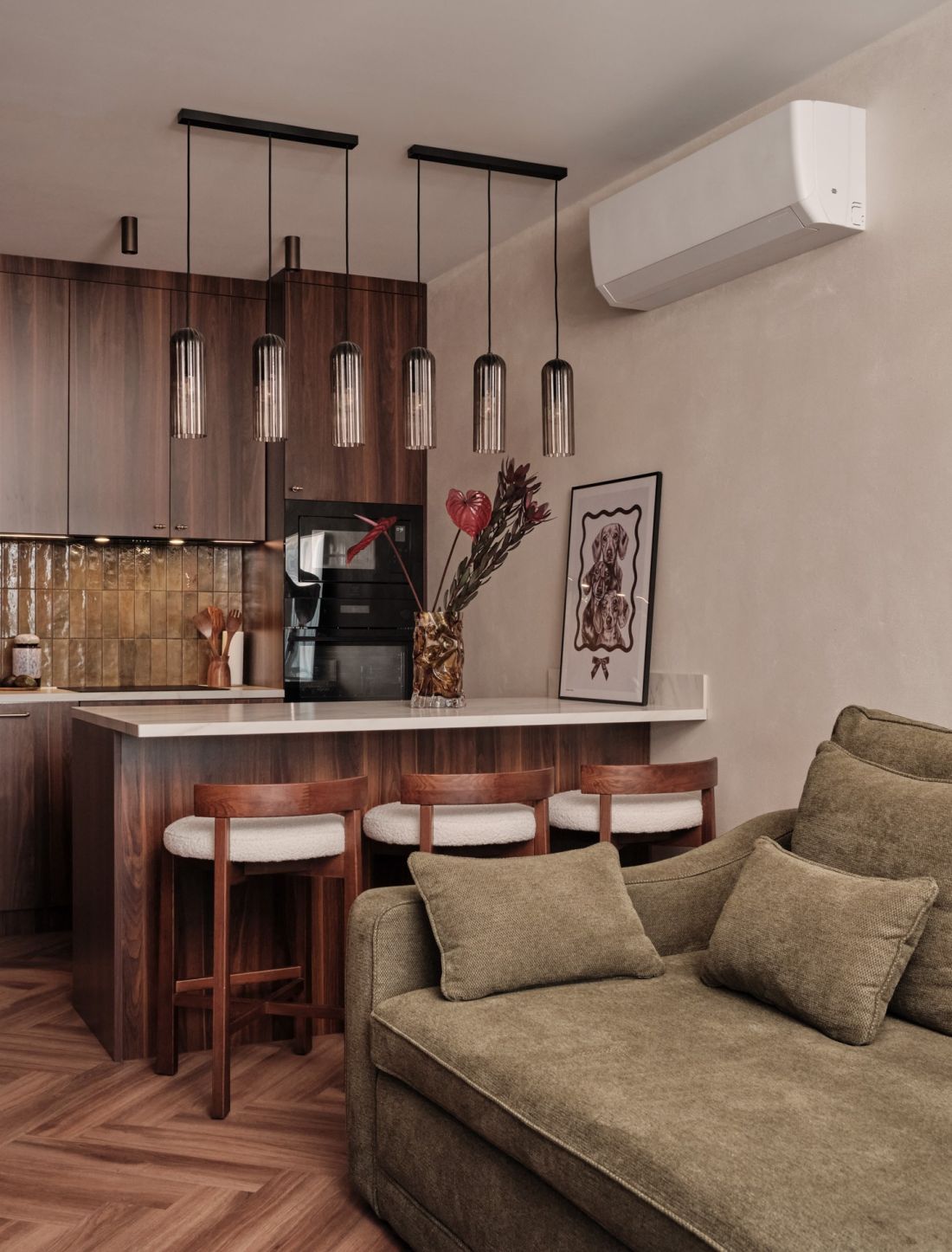
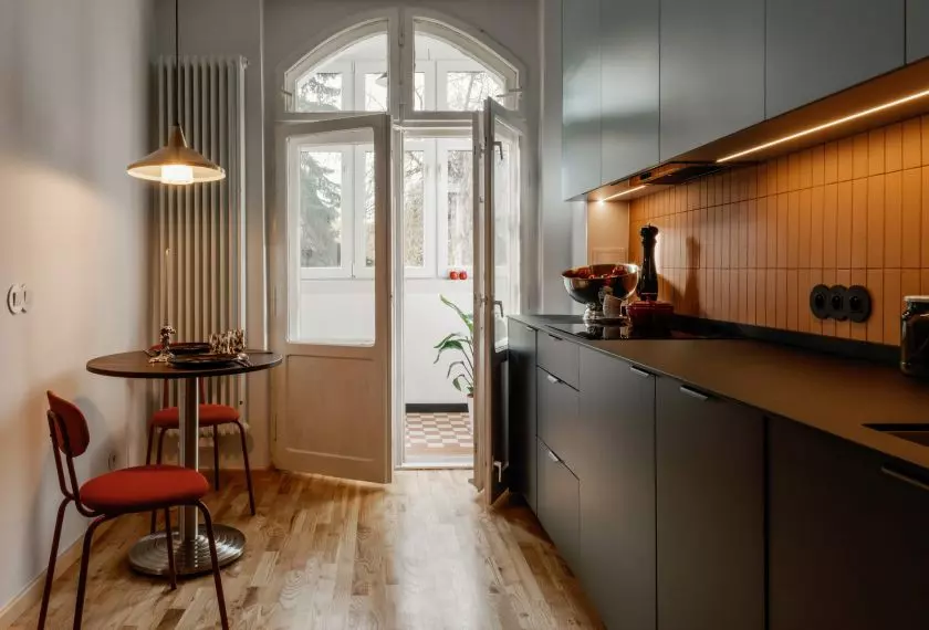
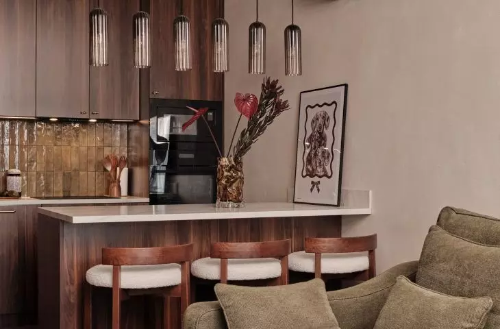
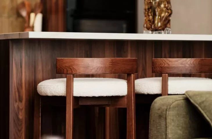
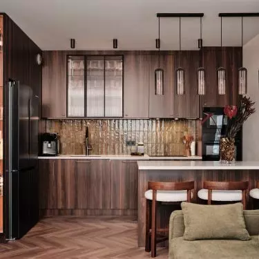
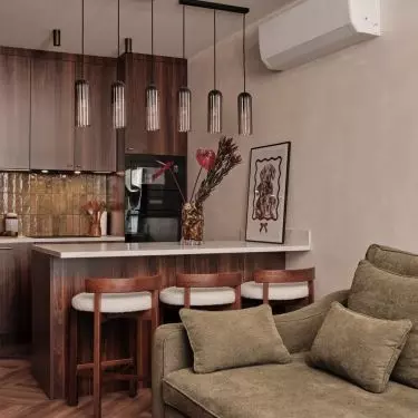
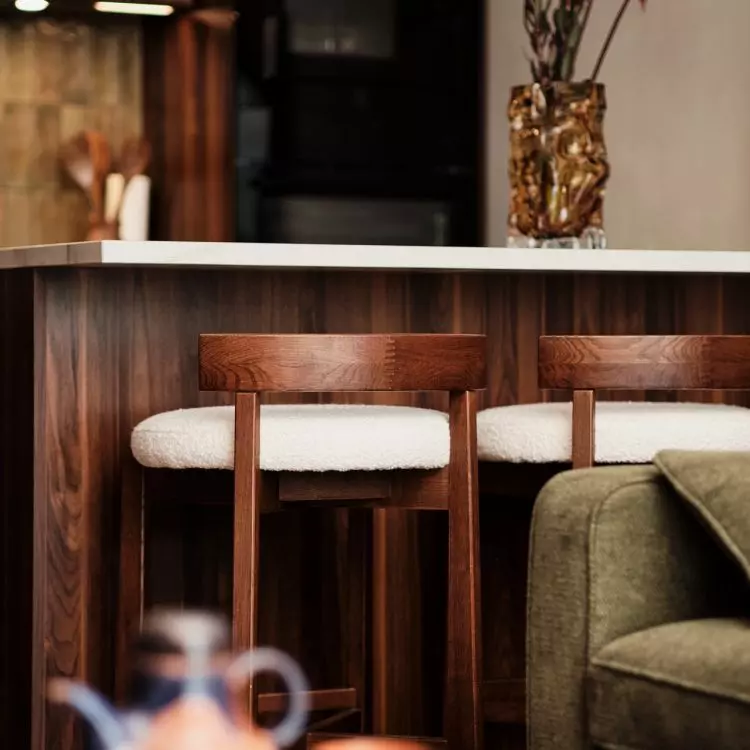
A kitchen island replaced the traditional table, connecting the kitchen to the living area — ©Jan Wąsowicz
the table gave way to a peninsula
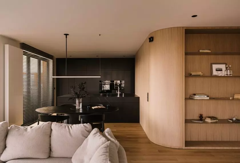
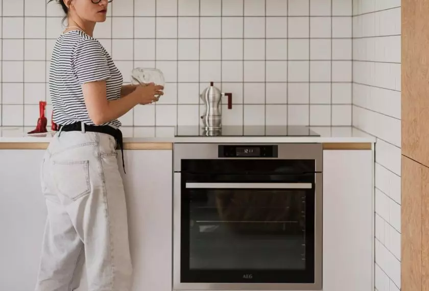
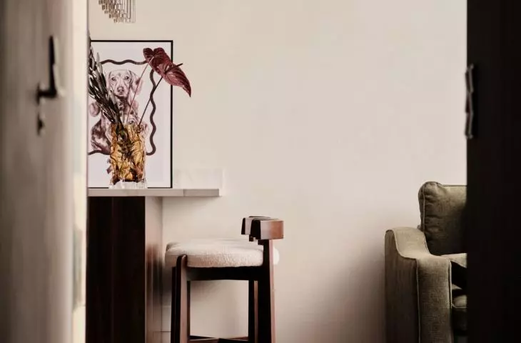
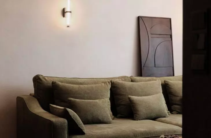
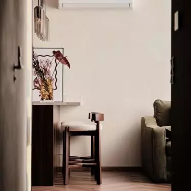
One of the most important decisions was to do away with the classic dining table. In a 52-square-meter space, another large piece of furniture would have restricted movement and made the living area feel too cramped. Its function was taken over by a spacious kitchen peninsula with seating. On a daily basis, it extends the countertop, and when friends visit, it becomes the center for cooking together and conversation. Thanks to this, there’s more space left in the living room for a comfortable, fold-out sofa. Another striking feature of this part of the apartment is the veneered TV cabinet in a deep cognac shade. Its design clearly reflects the direction taken throughout the project—rather than cluttering the space with flashy objects, the architects allowed select elements to take center stage.
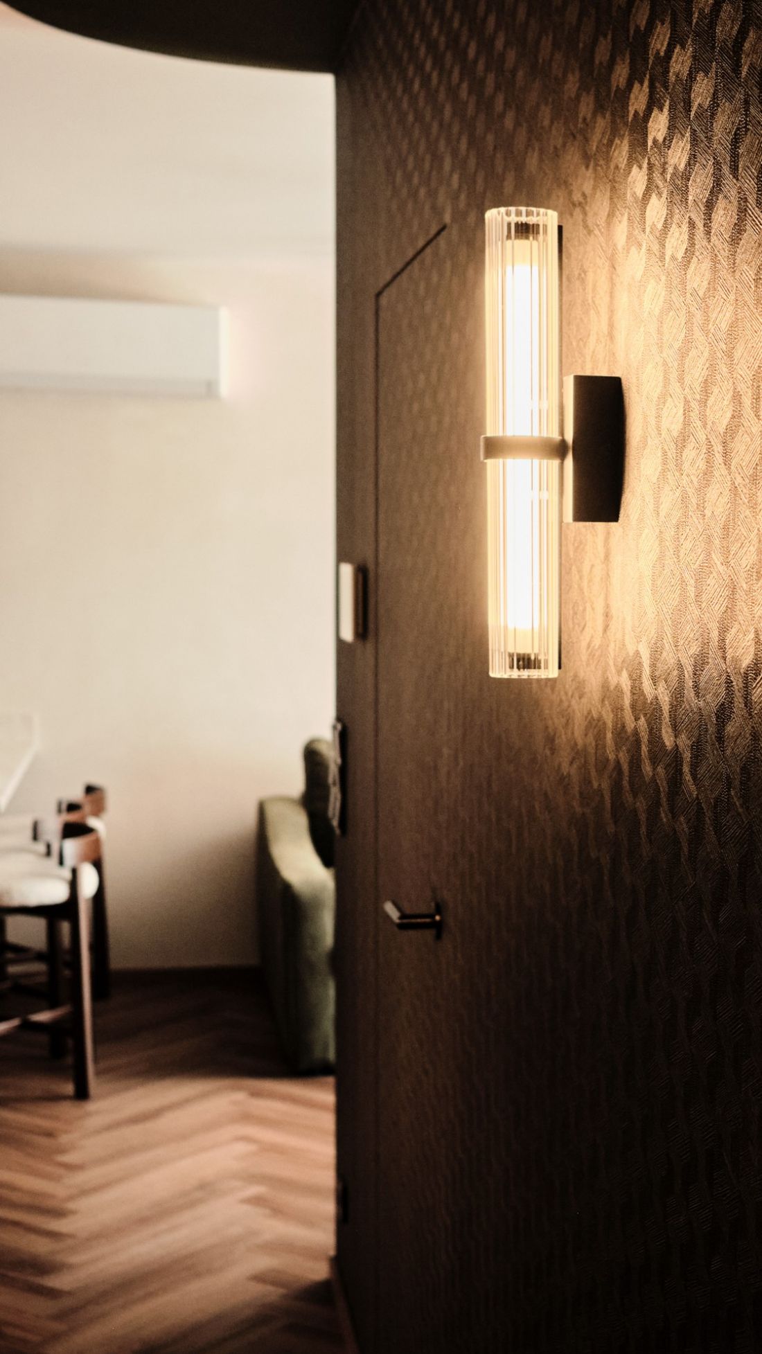
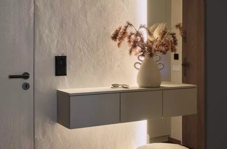
Embossed wallpaper covers the walls and hidden doors in the dark hallway — ©Jan Wąsowicz
The dark hallway has become one of the apartment’s strengths
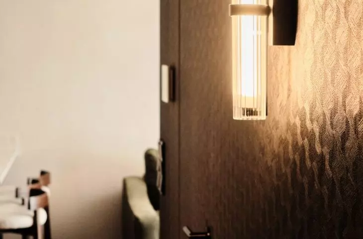
The problem with the existing layout was a long, narrow hallway devoid of natural light. However, SUSPENS studio decided to take an unconventional approach. Instead of trying at all costs to make it appear brighter, the designers emphasized its unique character even more. The ceiling was painted a dark green, and the walls were covered with richly colored wallpaper featuring an embossed pattern. The same material appears on the hidden doors, causing the individual partitions to almost disappear and giving the hallway a sense of visual depth. The textured surface also helps improve the acoustics of this narrow part of the apartment. Most important, however, is what lies at the end. From the dark entryway, the eye is naturally drawn toward the bright living area. Thus, instead of an inconvenient flaw, a deliberately designed sequence has been created—from the more intimate entryway to the open, light-filled living room.
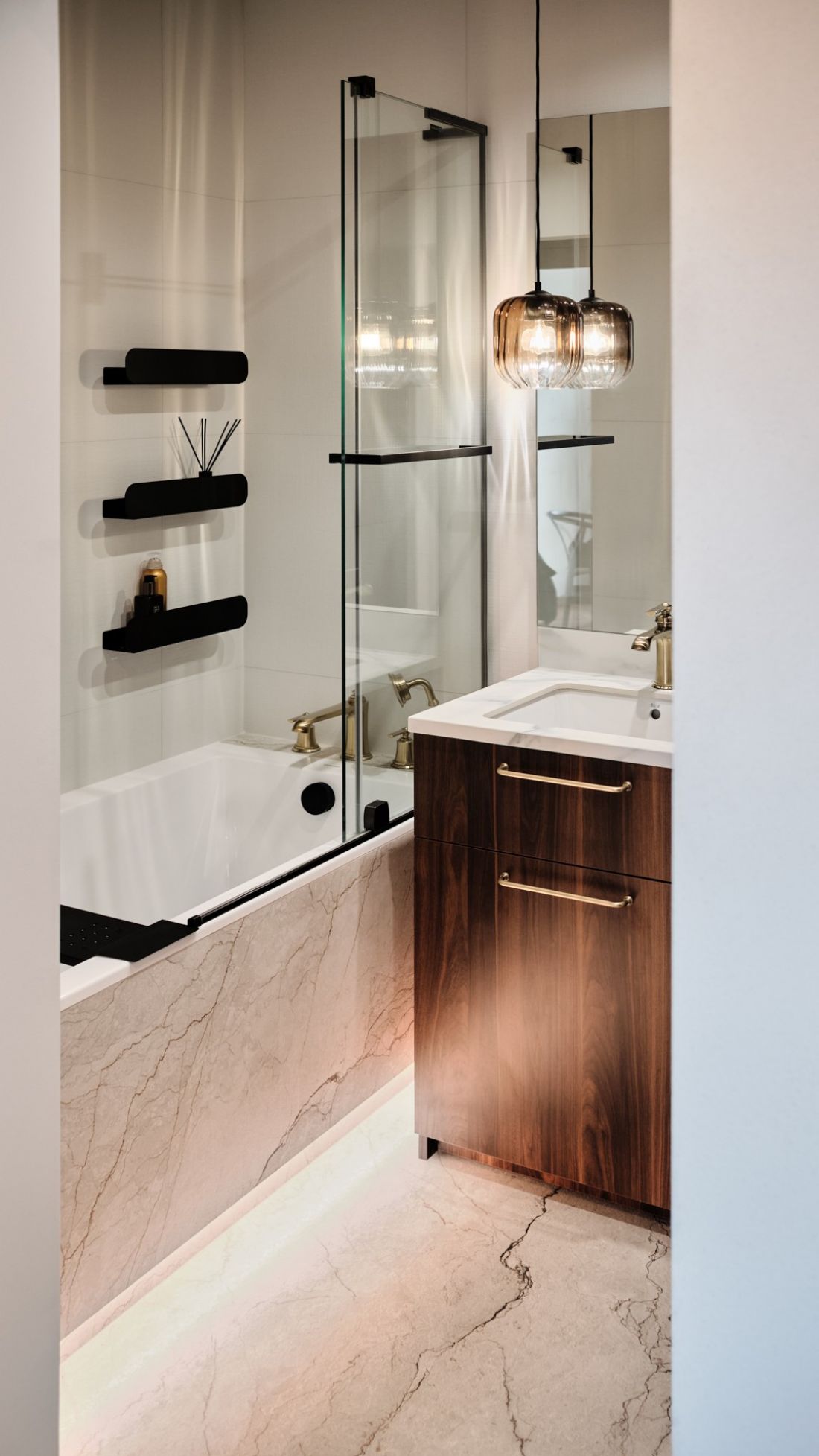
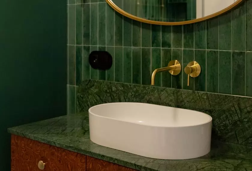
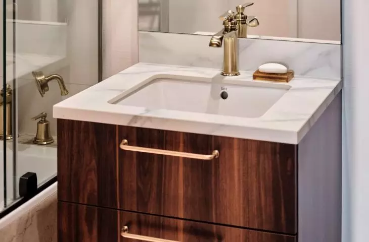
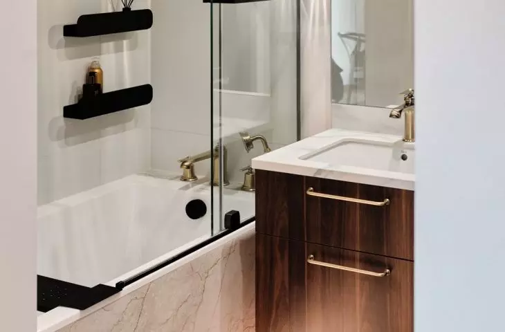
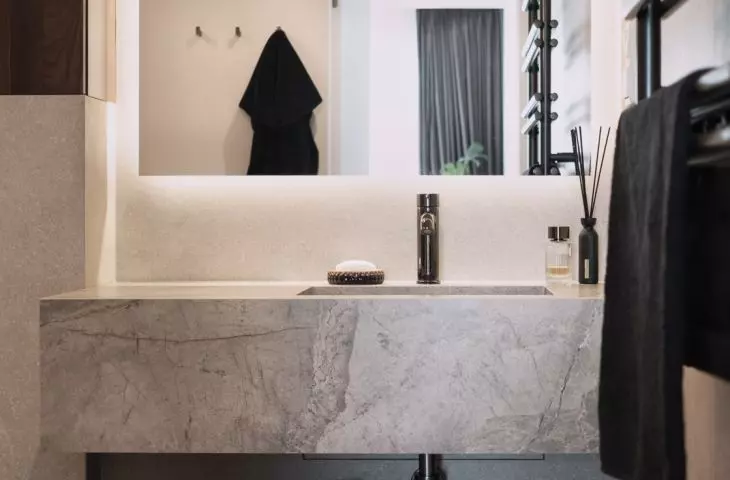
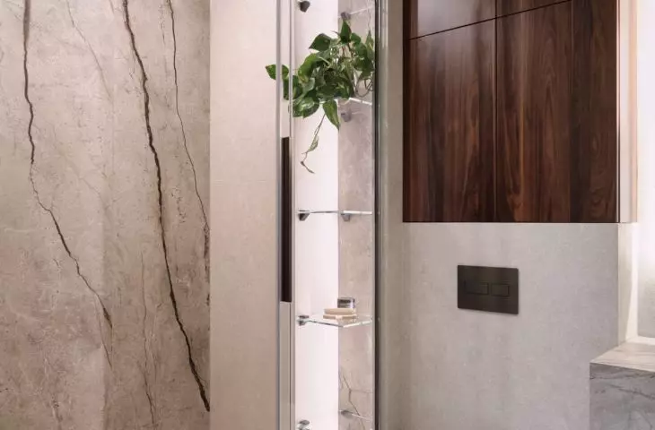
The bright bathroom is warmed by wood veneer and brass details — ©Jan Wąsowicz
private bathroom adjacent to the bedroom
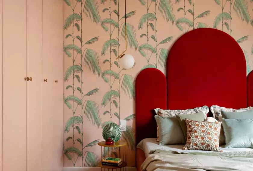
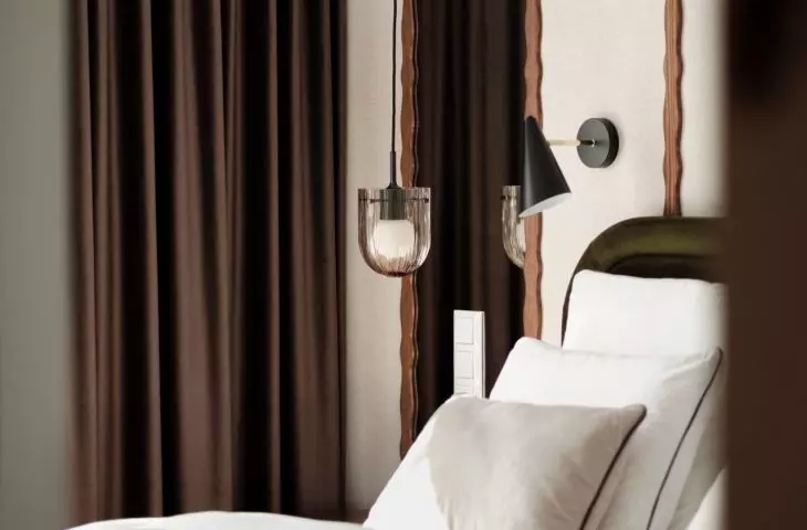
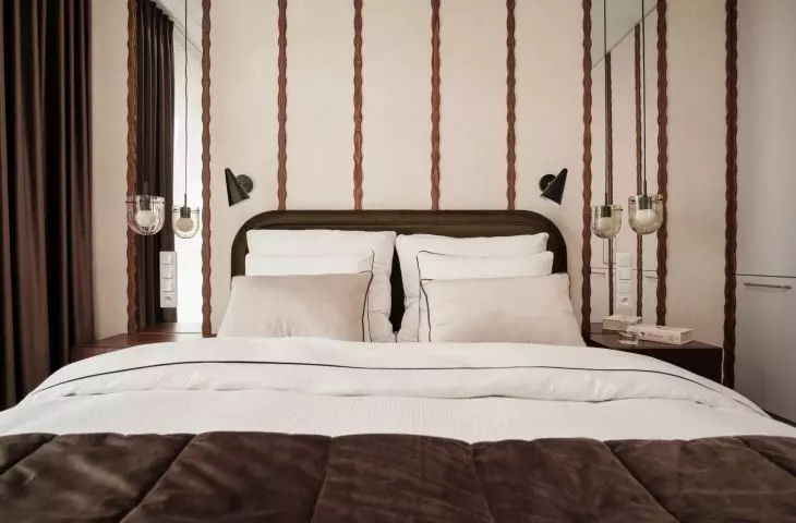
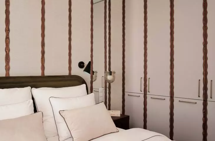
These compromises did not mean sacrificing elements that were particularly important to the owners. This is evident in the layout of the two bathrooms. The washer and dryer were moved to the smaller, shared bathroom with a tub. As a result, the second bathroom, located off the master bedroom, could remain a private space with a separate shower. The bedroom itself, in accordance with the residents’ wishes, was not burdened with additional functions. No attempt was made to fit a workspace or additional furnishings into it. It is intended primarily for rest—a luxury that, in small apartments, is often the first casualty in the battle for every square meter.
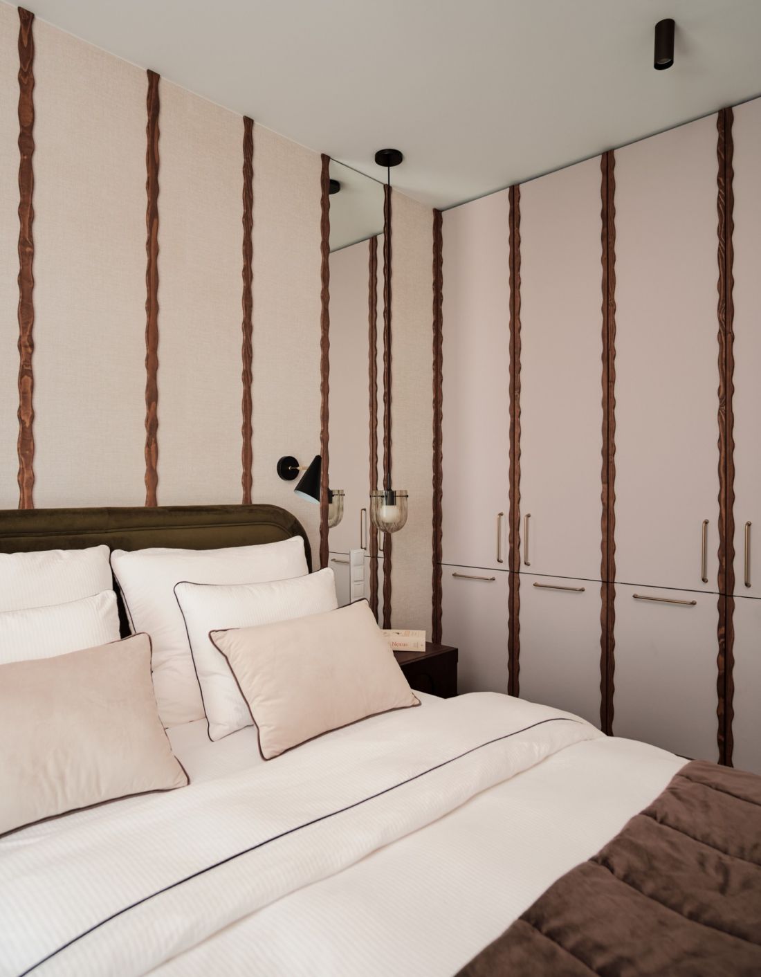
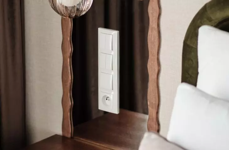
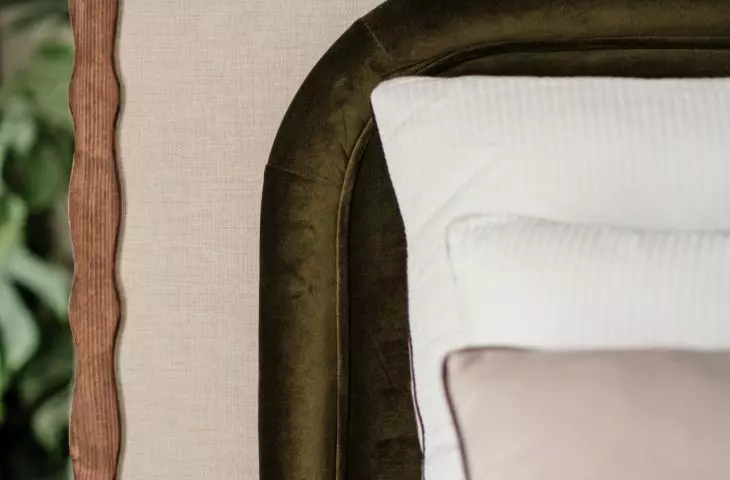
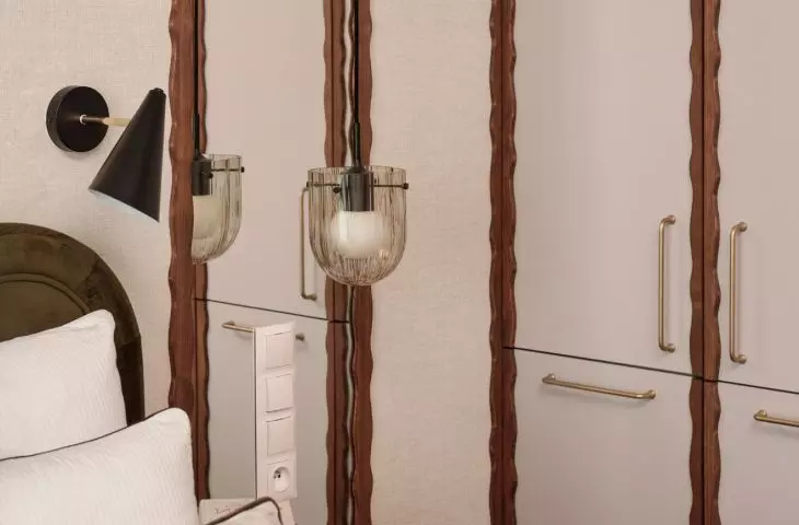
Wall-to-wall built-in cabinets provide plenty of storage space in the bedroom — ©Jan Wąsowicz
Between mid-century modern and wabi-sabi
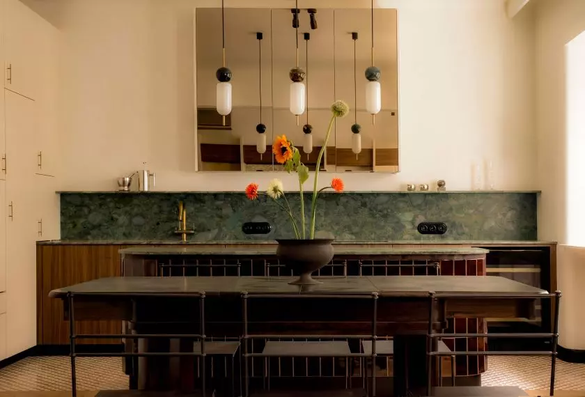
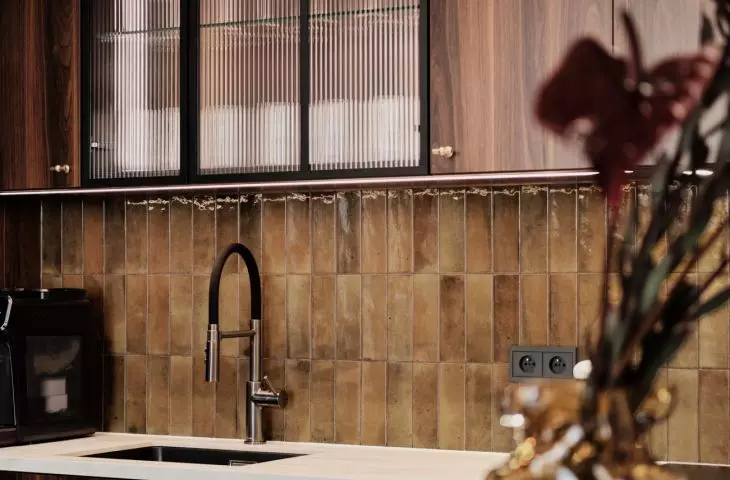
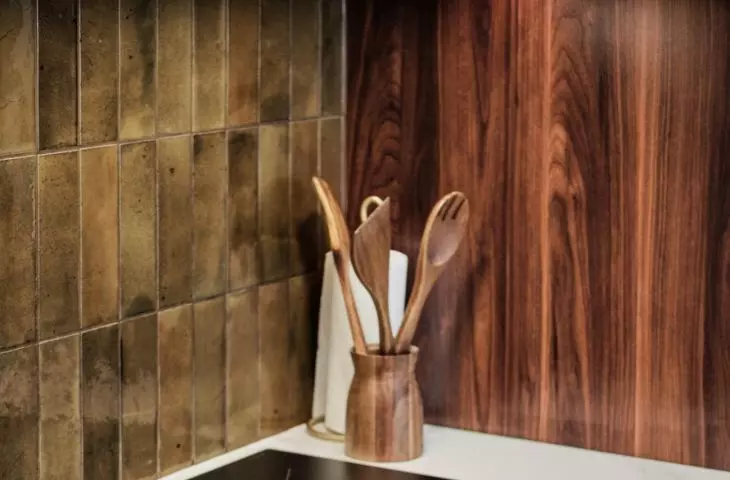
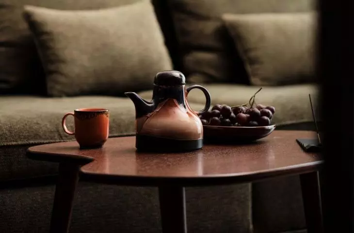
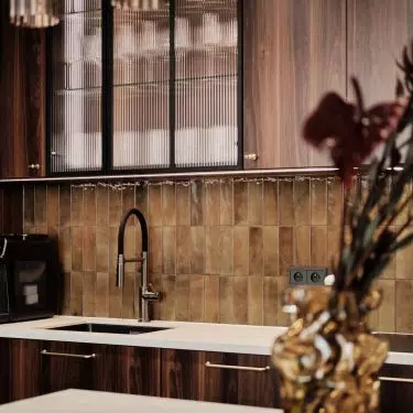
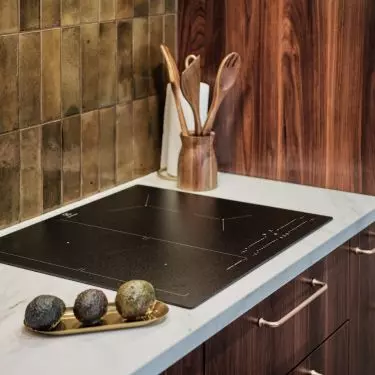
Although hundreds of online images served as the starting point, the finished apartment does not look like a collection of ideas borrowed from them. SUSPENS studio combined inspirations from mid-century modern design with the more raw and imperfect wabi-sabi aesthetic. Earth tones and natural, distinctive textures form a calm foundation. These are complemented by more decorative details: brass, fluted glass, and warm wood veneer. Textured clay plaster is also a key element. Its imperfect surface remains visible and serves as a backdrop for the refined furniture and lighting. As a result, the 52-square-meter space manages to harmonize far more elements than one might expect. However, the key wasn’t finding a place for every element from the inspiration board. Rather, the project demonstrates the opposite: sometimes the best way to create your dream interior is a conscious decision about what to leave out.